Understanding XML
General
Text
Multimedia
Interaction
Front-matter
All .xml files must contain the following as the first lines of the file.
---
---
These lines are referred to as the “front-matter”, and they tell Github to process the page so it can be loaded in the app.
<page>
After the front matter, all further content must be wrapped in a <page> tag.
---
---
<page>
    <!-- all content goes in here -->
</page>
<divider>
The <divider> tag inserts a dividing line between the prior and following content.
---
---
<page>
    <body>Here's some text</body>
    <divider />
    <body> Here's more text</body>
</page>

Platform Conditional
The platform attribute can be applied to any non-<page> element. Certain values will restrict the element to only be displayed on certain platforms.
For example, an element with the platform="desktop" attribute will only appear when the application is running on desktop devices.
The valid attribute arguments are:
- “mobile”
- “desktop”
Any other arguments will be ignored.
In general you should not use this! Only use it for situations where an element should only appear on mobile or desktop platforms (like a quit button).
Example
<button
    title="Quit"
    platform="desktop"
    action-0="application:quit"
/>
<title>
The <title> tag renders the text within in a large, bold font. It is similar to the <h1> tag in HTML.
<subtitle>
The <subtitle> tag renders the text within in a slightly smaller font than the title. It is similar to the <h2> tag in HTML.
<body>
The <body> tag renders the text within in a regular font suitable for reading. It is similar to the <p> tag in HTML.
<caption>
The <caption> tag renders the text within in a small, light-colored font.
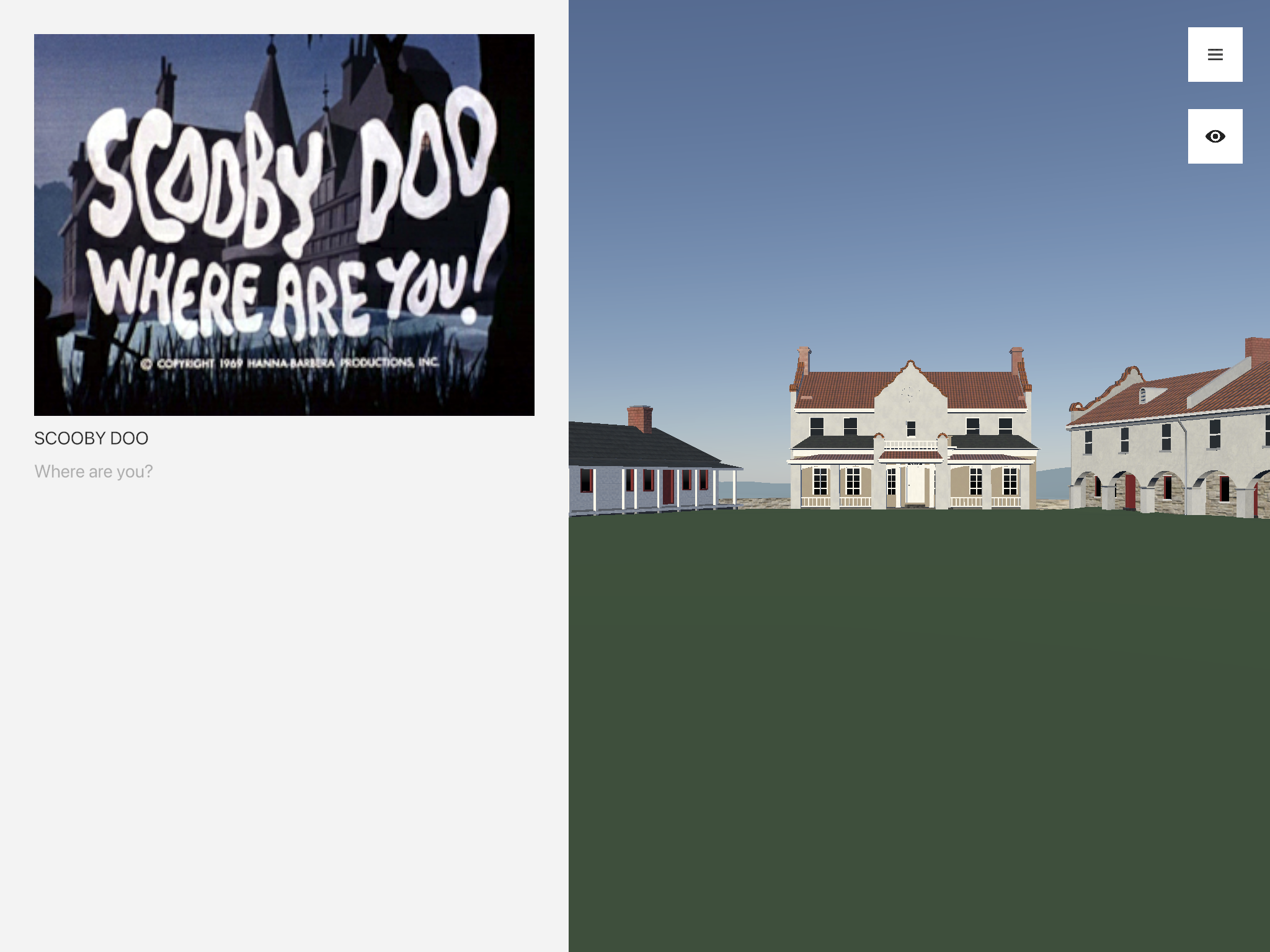
<image>
The <image> tag renders an image based on the provided attributes. When clicked, the image will expand into a full-screen view.
| Attribute | Requirement | Argument |
|---|---|---|
src |
required | a link to the image file (relative to the root directory of the data repository) |
title |
optional | a title to display under the image |
description |
optional | a subtitle to display under the image |
The source image file must be either .png, or .jpg.
Example
---
---
<page>
    <image
        src="/assets/example/scoobydoo.jpg"
        title="Scooby Doo"
        description="Where are you?"
    />
</page>
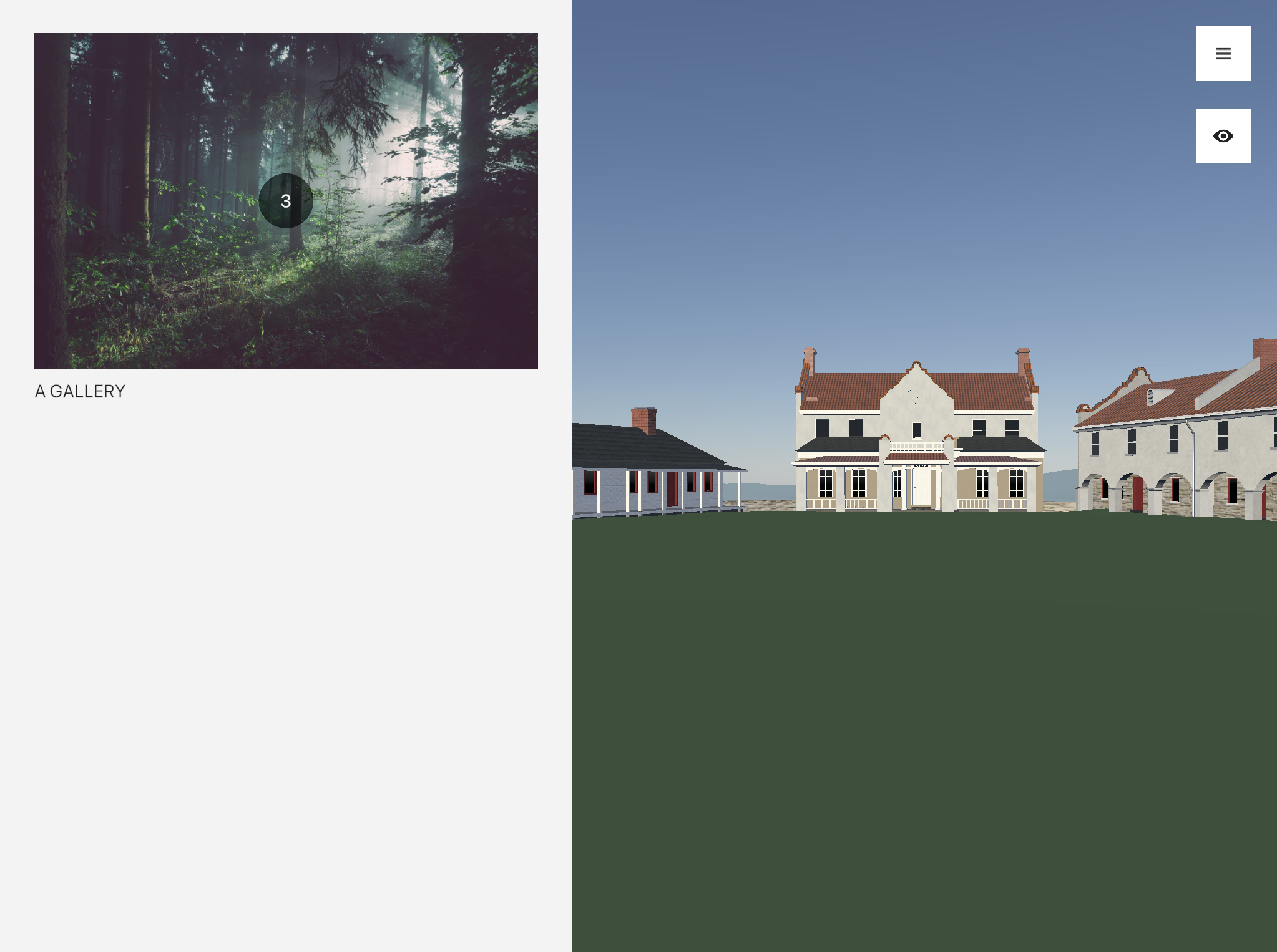
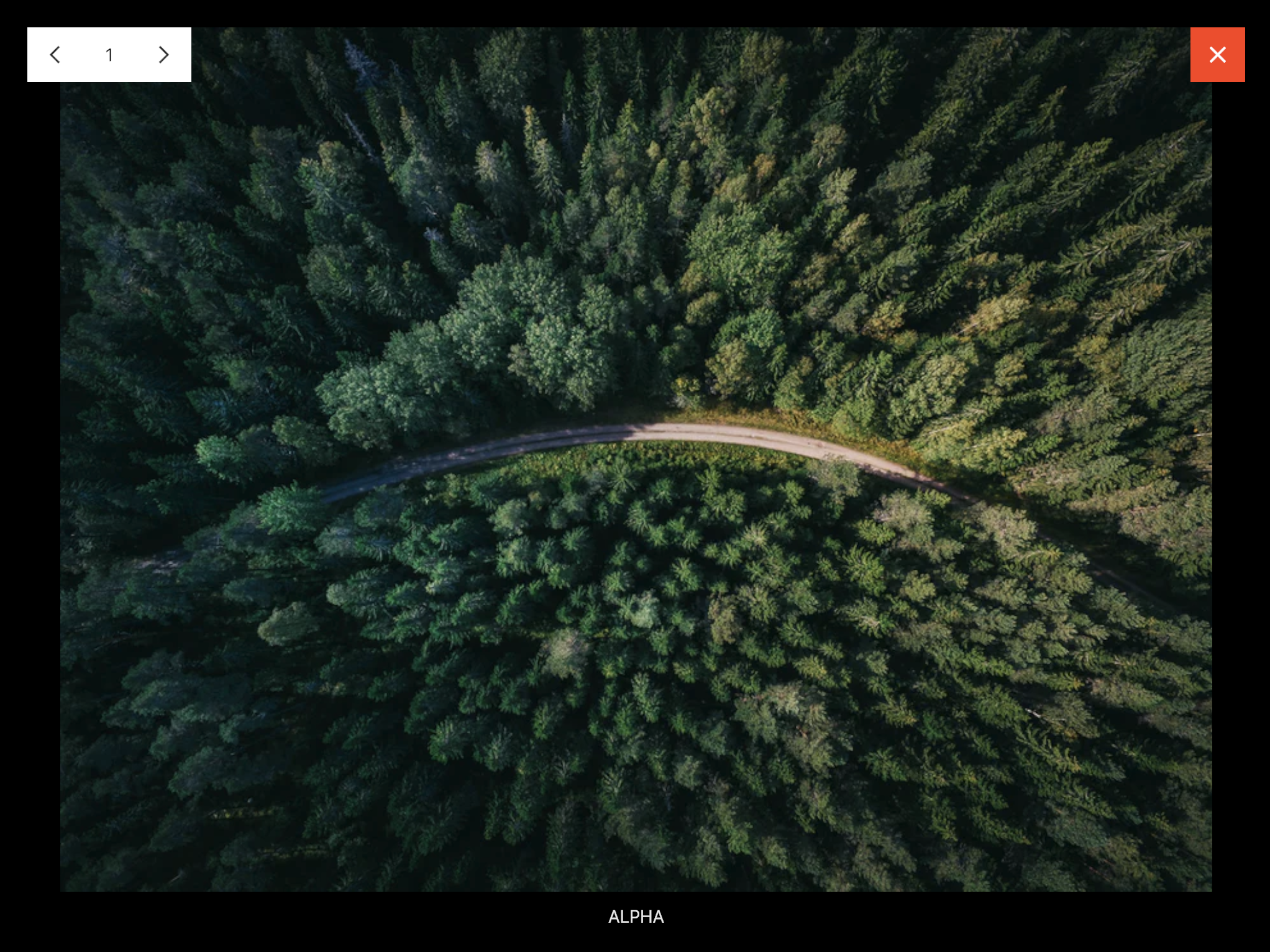
<gallery>
The <gallery> tag is similar to the <image> tag, in that it displays a single image. The difference is that, when the image is tapped, it expands into a full-screen view with “previous” and “next” controls to cycle through the galleries content.
| Attribute | Requirement | Argument |
|---|---|---|
src |
required | a link to the cover image file (relative to the root directory of the data repository) |
title |
optional | a title to display under the cover image |
description |
optional | a subtitle to display under the cover image |
The <gallery> tag can only contain <gallery-image> tags and comments as children.
<gallery-image>
The <gallery-image> tag should only be used within a <gallery> tag. It is otherwise identical to the <image> tag.
The source image files must be either .png, or .jpg.
Example
---
---
<page>
    <gallery
        src="/assets/example/coverphoto.png"
        title="A Gallery"
    >
        <gallery-image src="/assets/example/gallery1.png" title="Alpha">
        <gallery-image src="/assets/example/gallery2.png" title="Beta">
        <gallery-image src="/assets/example/gallery3.png" title="Gamma">
    </gallery>
</page>
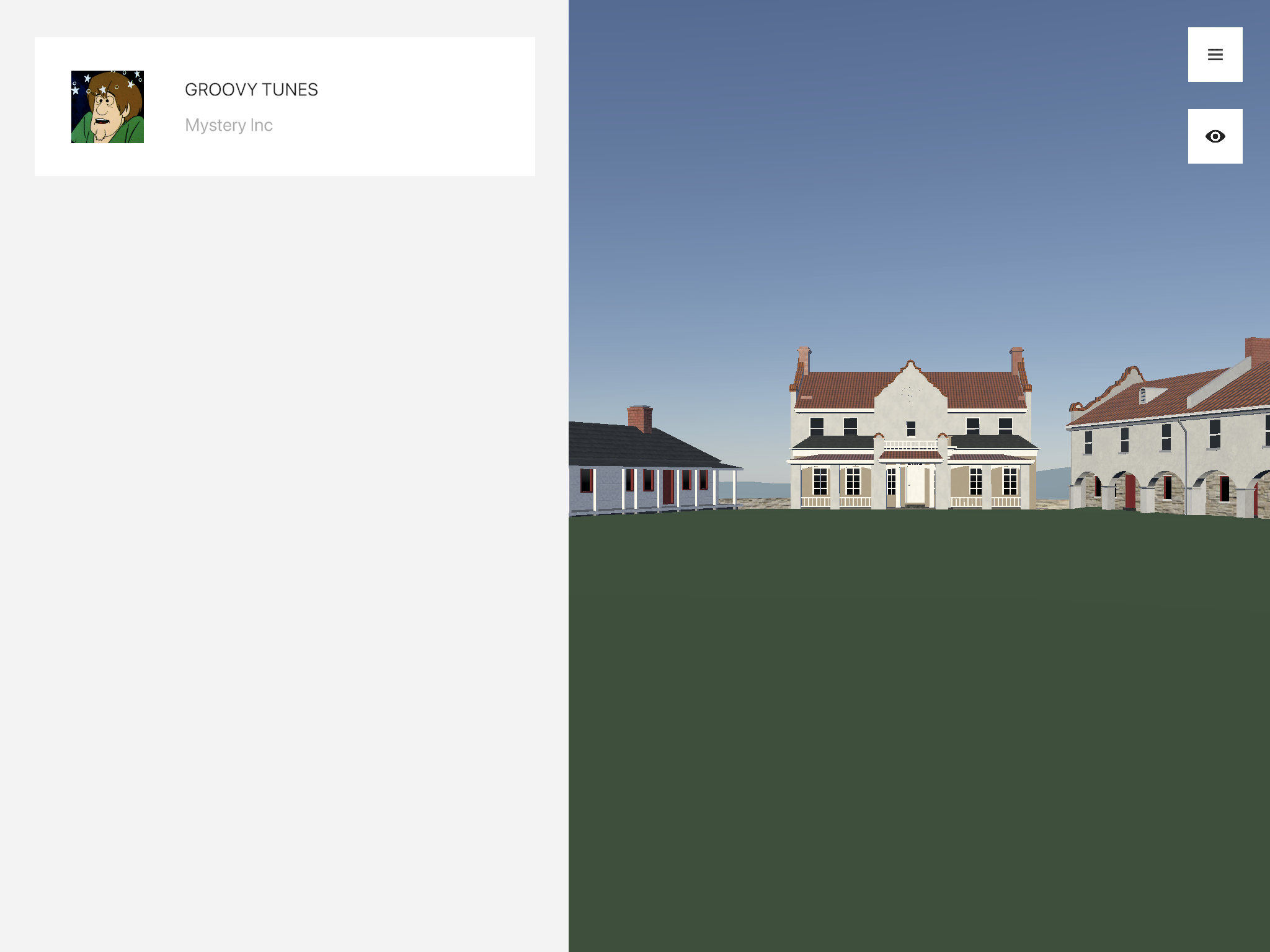
<audio>
The <audio> tag renders an audio player based on the provided attributes. When clicked, the audio player will start/stop playing.
| Attribute | Requirement | Argument |
|---|---|---|
src |
required | a link to the audio file (relative to the root directory of the data repository) |
icon-src |
optional | a link to an image file (relative to the root directory of the data repository), to be displayed on the audio player |
title |
optional | a title to display next to the icon |
description |
optional | a subtitle to display next to the icon |
The source audio file must be either .mp3, .wav. The source icon file must be either .png, or .jpg.
Example
---
---
<page>
    <audio
        src="/assets/example/audio.mp3"
        icon-src="/assets/example/audioicon.png"
        title="Groovy Tunes"
        description="Mystery Inc"
    />
</page>
Actions
All of the interaction-related tags make use of an action – argument system. This is defined by a list of action(s)
action-0="..." action-1="..."
and their associated argument(s)
action-0-argument-0="..." action-0-argument-1="..." action-1-argument-0="..."
For example, to open the menu and set the app’s calendar to 1820, the actions would be
action-0="menu:open"
action-1="history:set-year"
action-1-argument-0="1820"
action-1-argument-1="1820 CE"
| Action | Argument(s) | Functionality |
|---|---|---|
application:open-url |
any url | leaves the app and opens the given url in the device's web browser |
application:quit |
quits the application completely. you should be careful to only use this for quit buttons! | |
menu:toggle |
toggles the menu state (opens it if it's closed, and closes it if it's open) | |
menu:close |
closes the menu | |
menu:open |
opens the menu | |
menu:next-page |
the name of a page (as it appears in the _pages directory, without the .xml at the end) |
opens the specified page |
menu:previous-page |
opens the previously opened page | |
history:set-year |
any integer (e.g. 1820), followed by a string description of the preceding integer |
sets the current year that the fort is viewed in |
player:teleport |
either 3 floats (position x, y, and z), 5 floats (position x, y, and z, normalizedYaw, normalizedPitch), or 6 floats (position x, y, and z, normalizedYaw, normalizedPitch, and normalizedZoom) | Teleports the player to the specified position, and optionally points the camera in the specified direction |
player:set-mode |
toggle, first-person, or overview |
sets the camera mode to the specified mode (if no argument is provided, or the argument is toggle, then the mode is toggled) |
developer:clear-cache |
clears out the cached content stored on device | |
developer:refresh-content |
either no argument, or a url | reloads all the content from the given url (or the production data repository if no url is specified) |
tooltips:disable-on-page |
disables all tooltips while the given page is open. (NOTE: this can only be applied as an attribute to a <page> component) |
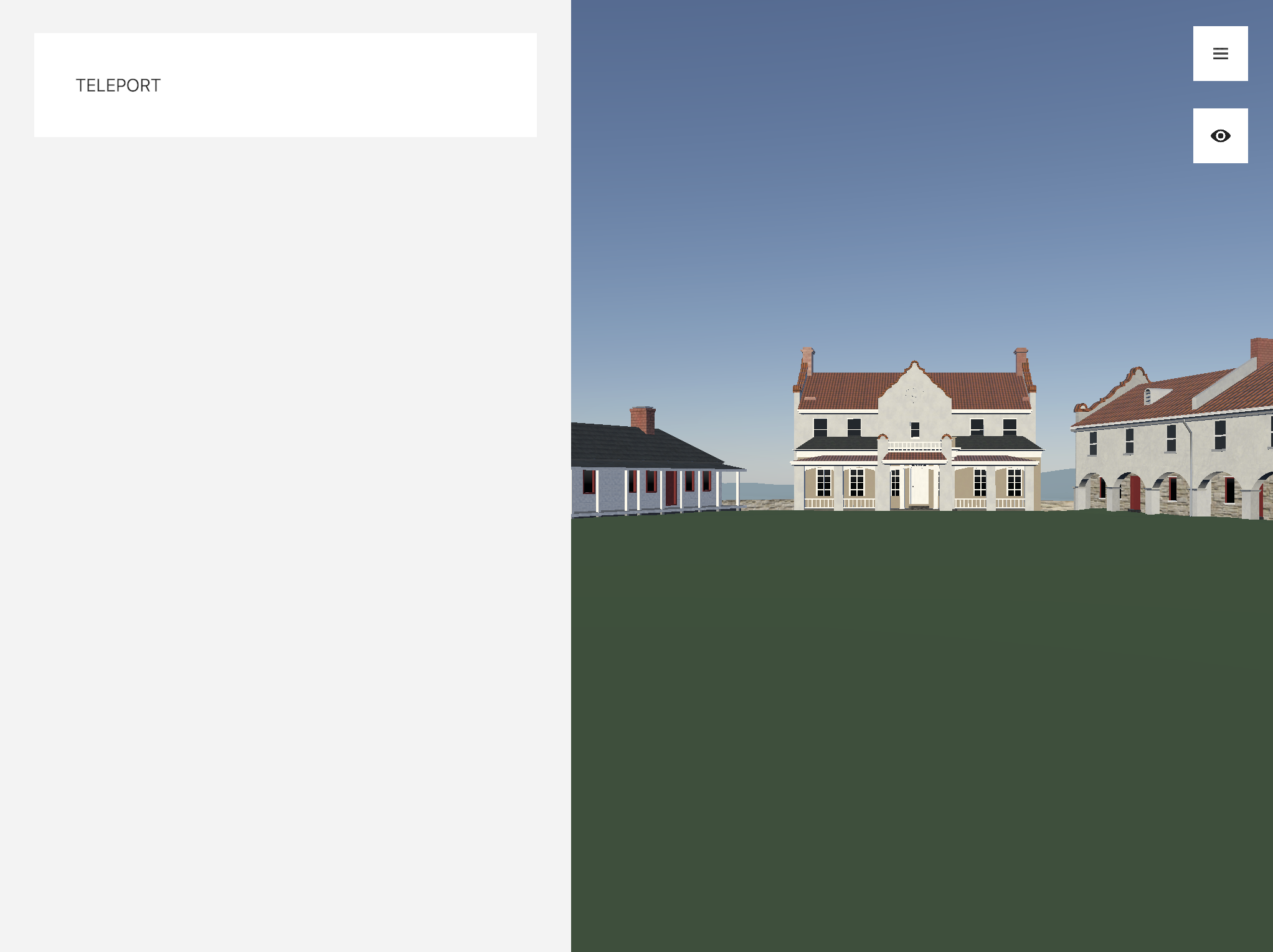
<button>
The <button> tag renders a button that users can click to control functionality in the app.
| Attribute | Requirement | Argument |
|---|---|---|
title |
optional | a title to display on the button |
description |
optional | a subtitle to display on the button |
style |
optional | an optional style to apply to the button. valid arguments are "negative", "positive", or nothing (for the default style) |
action-X |
optional | an action to perform when the button is clicked |
action-X-argument-Y |
optional | the Yth argument for the Xth action |
Example
---
---
<page>
    <!--
        Clicking this will teleport the player to (5, 4, 3)
        and set their normalized yaw and pitch to 0.5
    -->
    <button
        title="Teleport"
        action-0="player:teleport"
        action-0-argument-0="5"
        action-0-argument-1="4"
        action-0-argument-2="3"
        action-0-argument-3="0.5"
        action-0-argument-4="0.5"
    />
</page>
<icon-button>
The <icon-button> tag renders a square icon button that users can click to control functionality in the app.
| Attribute | Requirement | Argument |
|---|---|---|
src |
required | a link to the icon file (relative to the root directory of the data repository) |
action-X |
optional | an action to perform when the button is clicked |
action-X-argument-Y |
optional | the Yth argument for the Xth action |
The source icon file must be either .png, or .jpg.
Example
---
---
<page>
    <icon-button
        src="/assets/example/left-arrow.png"
        action-0="menu:previous-page"
    />
</page>
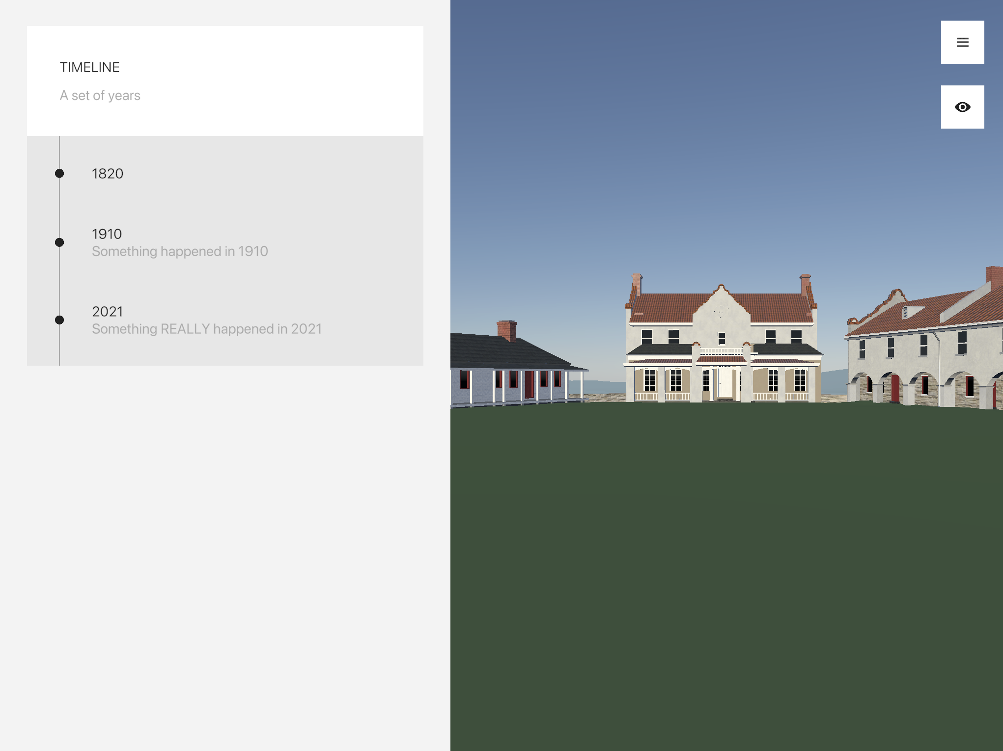
<timeline>
The <timeline> tag renders a list of buttons, each representing a year. The correct year is highlighted based on the app calendar.
| Attribute | Requirement | Argument |
|---|---|---|
collapsible |
optional | true or false |
title |
optional | a title to display on the timeline button (only visible if collapsible is true) |
description |
optional | a subtitle to display on the timeline button (only visible if collapsible is true) |
action-X |
optional | an action to perform when any button in the timeline is clicked |
action-X-argument-Y |
optional | the Yth argument for the Xth action |
The <timeline> tag should only contain <timeline-button> tags and comments as children.
<timeline-button>
The <timeline-button> tag renders a button within a <timeline> tag. If the calendar year matches the buttons year, then the button is highlighted.
| Attribute | Requirement | Argument |
|---|---|---|
year |
required | an integer (e.g. 1820) |
title |
optional | a title to display on the button |
description |
optional | a subtitle to display on the button |
action-X |
optional | an action to perform when the button is clicked |
action-X-argument-Y |
optional | the Yth argument for the Xth action |
Example
---
---
<page>

    <!--
        Closes the menu when ANY button in the timeline is clicked,
        and sets the calendar to a different year depending on the button.
    -->
    <timeline
        collapsible="true"
        title="Timeline"
        description="A set of years"
        action-0="menu:close"
    >
        <timeline-button
            year="1820"
            title="1820"
            action-0="history:set-year"
            action-0-argument-0="1820"
            action-0-argument-1="1820 CE"
        />

        <timeline-button
            year="1910"
            title="1910"
            description="Something happened in 1910"
            action-0="history:set-year"
            action-0-argument-0="1910"
            action-0-argument-1="1910 CE"
        />

        <timeline-button
            year="2021"
            title="2021"
            description="Something REALLY happened in 2021"
            action-0="history:set-year"
            action-0-argument-0="2021"
            action-0-argument-1="2021 CE"
        />
    </timeline>
</page>